Change of corporate font
August 20, 2025 - Reading time: 7 minutes
 In 2011, the Flow Platform, then ScheduleInterpreter, was formed. As a commercial enterprise, we invested extra time to review and test dozens of fonts to ensure they were aesthetically pleasing and easy to read. Our choice at the time was a Sans type style, and several candidates made it to the final list. In the end, we selected WeblySleek UI, an open-source font that was very clean, offered great readability, and provided the level of familiarity our customers expected. Fast forward to 2025 and a lot of things have changed. In May 2025, we initiated a new research into modern typesets. This time around, we wanted to explore new horizons and provide our customers better accessibility and readability on small devices. We wanted to combine a new style with the one we built for our platform. The research took approximately two months, and by the middle of August 2025, the decision was made to adopt Noto Sans as the new corporate font. Noto Sans is also an open-source font that offers a nearly identical ligature while bringing new, exciting features previously not available.
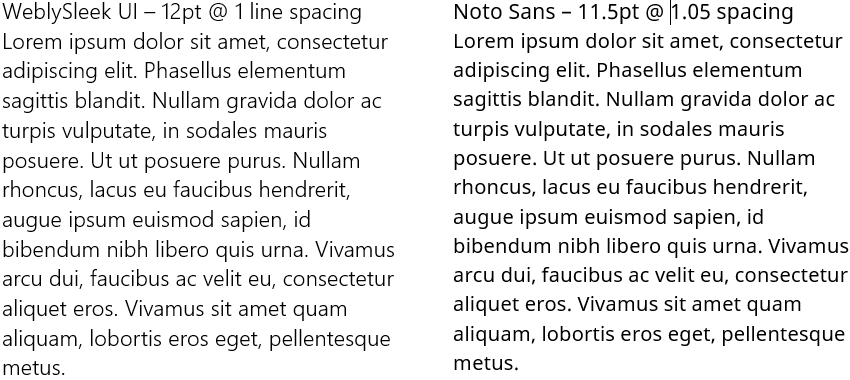
First, the Noto Sans font offers much better readability due to its more pronounced thickness. A comparison of the two fonts shows Noto Sans at a smaller font size and 5% increased line spacing.
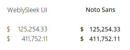
Monospaced numbers help create much better readability in tables with accounting information, especially when currency is used or decimal and thousands separators are part of the formatting. Noto Sans displays numbers in a format that is both easier to read and properly aligned, making it easier to see the differences in the numbers.
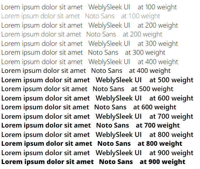
Another exceptional benefit of using Noto Sans is its flexible weight structure. While WeblySleek UI demonstrates exceptional readability at a weight of 100, it can only produce two distinctive weights: 100 and 500. Noto Sans can continue to expand its weight with each 100-point increment. It even offers intermediate weights, for example, 315. This quality can dramatically improve UI design to bring focus to text content by making it bolder and more prominent.
Noto Sans also offers some additional advantages, especially in accessibility. For example, the capital letter 'I' has horizontal bars at the top and the bottom, clearly showing that it is not a lowercase 'l'.

Migrating from WeblySleek UI to Noto Sans is an excellent choice for the Flow Platform and its users, primarily because it significantly enhances accessibility, readability, and design flexibility. While WeblySleek UI served its purpose, Noto Sans is a major upgrade that aligns with modern web standards and user expectations. Noto Sans provides superior readability due to its more defined thickness and well-designed letterforms, making text easier to read and understand, even at smaller sizes and on mobile devices. This is crucial for accessibility, benefiting users with visual impairments or reading difficulties. For instance, the unique horizontal bars on the capital letter 'I' prevent it from being confused with a lowercase 'l', which improves clarity in data-heavy contexts. The monospaced numbers are a standout feature for the platform's users who work with financial and numerical data. By ensuring all digits occupy the same horizontal space, Noto Sans keeps numbers perfectly aligned in tables. This makes it much easier to compare values, spot discrepancies, and read financial information without strain. Finally, the extensive weight structure of Noto Sans offers our design team unparalleled flexibility. Unlike WeblySleek UI's limited two weights, Noto Sans provides a continuous range of weights, from extra-light to bold, including intermediate values. This allows for a more dynamic user interface, where we can use different text weights to create visual hierarchy, draw attention to key information, and improve the overall design without sacrificing readability. In short, Noto Sans doesn't just look better; it makes the Flow Platform more accessible, functional, and user-friendly.