Crafting the Flow logo
October 13, 2023 - Reading time: 6 minutes
 Designing a logo for a company or a product is a creative process filled with passion. In this post, we delve into the fascinating journey of how the Flow logo for ScheduleInterpreter® came into existence. It begins with the history of the name and unfolds into a vibrant and purposeful visual identity that represents the essence of the platform. We already new the brand, its values, and the product's unique features. With more than 12 years on the market, identity of the target audience and the message the logo should convey were well established.
The History of the Name: Flow Emerges
Every great service or product begins with a simple idea. ScheduleInterpreter® was initially developed as an ERP platform and continues to remains true to its DNA. Along the way, we have built many tools and added more options to help our subscribers be more efficient, productive and successful. One such project, known as "Flow," began as a small endeavor but soon evolved into a significant part of our platform's philosophy.
The name "Flow" stuck, resonating with its role in optimizing workflows and process management. As this name became synonymous with innovation and progress, it naturally evolved into a pivotal element of our brand identity.
The Name as a Logo: The Foundation of the Design
Dennis Ayzin, the President and CEO of ScheduleInterpreter, envisioned a logo that incorporated the platform's name. This concept became the cornerstone of the design process. "Flow," with its single syllable and vowel creates gravitational field right in the middle, and perfectly conveys the platform's focus on workflow optimization. With this idea in mind, the creative process took flight.
A Fresh Start with Familiarity
Throughout its history, the ScheduleInterpreter® platform has maintained a consistent user interface. Evolution is essential, but maintaining familiarity is equally important, especially when you have nearly 200,000 users. Nevertheless, in line with our commitment to innovation, we pursued the idea of subtle yet impactful alterations. The logo's design aimed to convey the sense that users were embracing a new tool that felt both fresh and familiar.

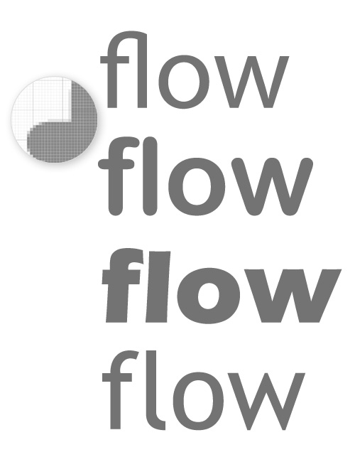
The quest for the right font began, and we scoured online font libraries, which house hundreds of thousands of typefaces. It quickly became evident that an "off-the-shelf" solution would likely not suffice for our unique requirements.
The Creative Process with Focus on "O"
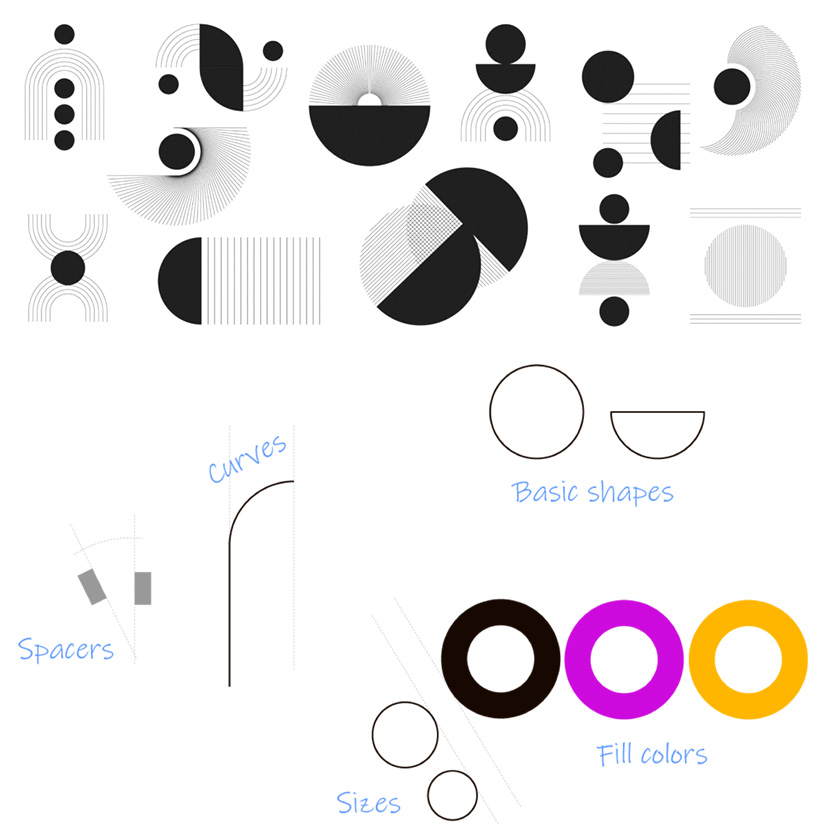
Being a single-vowel word, "Flow" naturally places the letter "O" at the center of attention. The idea of a perfect circle emerged as a dominant theme. We drew inspiration from mid-century contemporary designs like Bauhaus, Charles and Ray Eames, and Arne Jacobsen. Clean lines, muted tones, graphic shapes, vibrant colors, and striking differences guided our creative process.

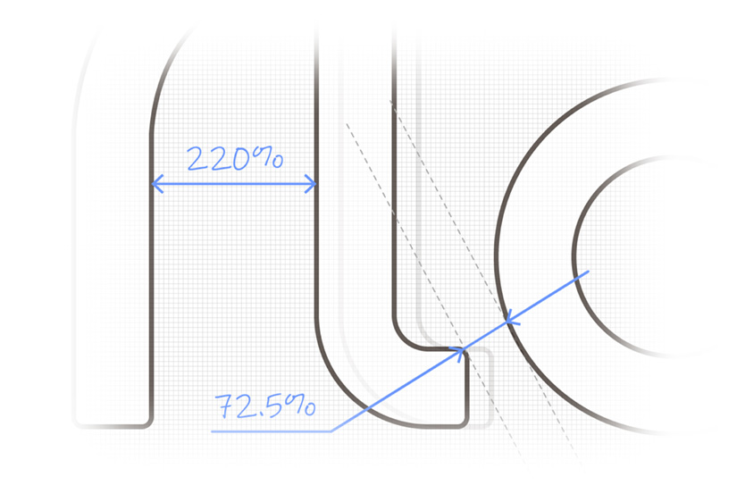
The use of a perfect circle for the "O" allowed us to create simple dependencies between various shapes of the logo. A change of direction in any line was executed using an arc, symbolizing the natural flow.
Bold and Muted: Color and Shape
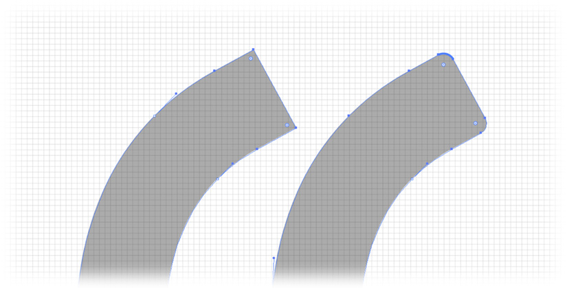
As our designs started to show promise, we tackled the question of sharp corners. With letters forming, all of them, except the "O" had two 90-degree corners where the line would end. Embracing the mid-century contemporary design vision, we explored the concept of "muted tones" for the corners, helping to keep the vibrant colors for fills.

Final Touches and Whitespace
The magic of whitespace played a crucial role in the final design. In modern design, the maxim "less is more" guides the way. Minor alignments and adjustments were made to ensure perfection, as our subscribers would frequently encounter this logo on their screens.

Colors: An Elegant Duo-Tone Solution
With the logo's shape well-defined, color selection became relatively straightforward. The focus on the letter "O" allowed us to opt for a simple and elegant duo-tone solution. This versatile approach retained the logo's uniqueness and ensured instant recognition, regardless of the color combination used, but also paved the way for the possibility of introducing seasonal or annual updates without compromising brand identity.

Conclusion
After years of using the name ScheduleInterpreter® for our product line, the evolution of the "Flow" label signifies more than just a name. It represents the intrinsic value and nature of both the product and the comprehensive solution we offer to our valued customers. The Flow logo is a vibrant emblem of the joyful creative journey that brought it to life, reflecting our dedication to innovation, efficiency, and progress.