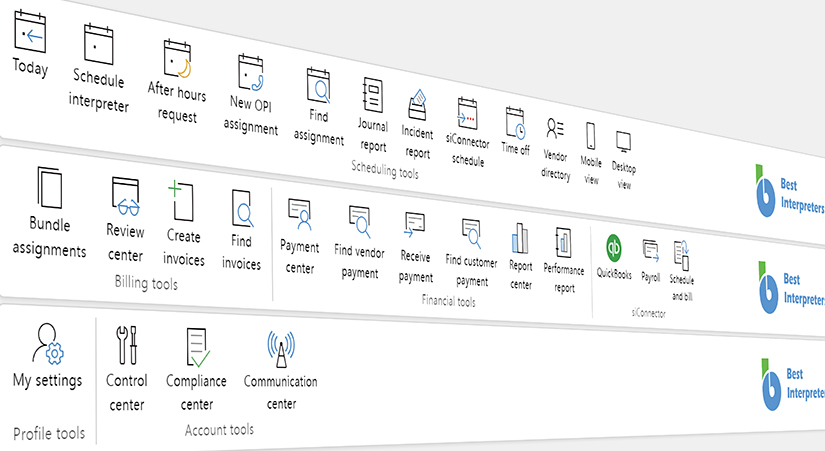
New platform interface is on its way. New icons, new tools, new functionalities.
April 20, 2023 - Reading time: 3 minutes
 New ScheduleInterpreter® interface update begins on April 24, 2023. In today's fast-paced world, we are constantly juggling a variety of tasks and responsibilities. Whether it's work-related or personal, keeping track of everything can be overwhelming. This is where the ScheduleInterpreter® platform comes in - a powerful tool designed to simplify the task management process. ScheduleInterpreter® platform is undergoing a major revamp, with a focus on the end-user. The new interface is more modern, elegant, and user-friendly, making it easier for users to navigate and accomplish their tasks efficiently.


One of the most noticeable changes in the new design is the use of more descriptive and intuitive icons. These icons are not only aesthetically pleasing but also make it easier for users to quickly understand the purpose of each feature. With just a glance, users can easily identify which button or option to click on to accomplish their task.
In addition, the color scheme has been revamped to create a more cohesive and visually appealing experience. The new color palette is calming and soothing, making the platform easier on the eyes and more pleasant to use.
Another key aspect of the new design is the use of plain text labels. This ensures that users can easily understand the purpose of each feature without having to guess or rely on context clues. The language used throughout the platform is straightforward and concise, reducing the likelihood of confusion or misinterpretation.
The new design is the result of years of research and analysis of Flawless Analytics data. This data was used to understand user behavior, preferences, and pain points, which in turn helped inform the design decisions made in the new interface. The end result is a platform that is tailored to the needs and preferences of its users, making it more efficient and effective.
In conclusion, the new interface for the ScheduleInterpreter® platform is a game-changer for users. The focus on the end-user, with the use of elegant and descriptive icons, revamped color scheme, and plain text labels, makes the platform more intuitive, efficient, and user-friendly. With this new design, users can focus on their tasks and responsibilities without the added stress of trying to navigate a complex interface.