Unlock the Power of Your Data: Introducing Visualizations in Flow Platform's Report Center
August 18, 2025 - Reading time: 4 minutes
 We are welcoming a significant upgrade to the Flow Platform's Report Center, with focus on bringing your data to life with a range of powerful visualization options! Say goodbye to endless spreadsheets and hello to clear, insightful visuals that empower you to understand your business like never before.
Visualize Your Insights
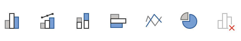
The enhanced Report Center now supports a variety of chart types, including columns, combo (column and line), stacked columns, lines, horizontal bars, and pie charts. This means you can now transform raw data into easily digestible visual representations, allowing you to:
-
Identify Trends: Spot patterns and trends at a glance, enabling proactive decision-making. For example, a line chart can clearly show sales growth over time.
-
Compare Performance: Easily compare different data sets or categories. Stacked column charts are perfect for visualizing the contribution of various components to a whole.
-
Understand Proportions: Pie charts offer a clear view of how different parts make up a whole, ideal for analyzing market share or budget allocation.
-
Highlight Key Metrics: Use visualizations to draw attention to critical data points and performance indicators.
Streamlined Data Management with the Data Dock
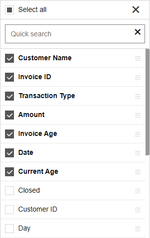
We've also revamped how you interact with your data fields by introducing a dynamic data dock on the right side. This intuitive feature allows you to:
-
Organize Your Data: Effortlessly arrange fields using grouping, making it easier to structure your reports.
-
Apply Filters: Quickly filter data to focus on specific segments and gain deeper insights.
-
Designate Rows and Columns: Clearly define how your data is presented in your chosen visualization.
The data dock provides a centralized and user-friendly interface for managing your data, giving you greater control over your reports.
Save, Share, and Collaborate Seamlessly
Just like before, all your custom reports and their visualizations can be saved to your personal collection. This allows you to build a library of insightful reports that are always at your fingertips. Furthermore, you can easily share these reports with team members, vendors, or customers, providing instant access to the data in a visually appealing and understandable format. This fosters better communication and data-driven collaboration.
Becoming Your Central Analytics Toolset
By bringing together robust visualization capabilities and intuitive data management, the Flow Platform's enhanced Report Center is poised to become your central analytics toolset. We believe this upgrade will provide even more benefits, including:
-
Faster Decision-Making: Visualizations allow you to quickly grasp key information, leading to quicker and more informed decisions.
-
Improved Data Understanding: Presenting data visually makes complex information more accessible and easier to understand for a wider audience.
-
Enhanced Communication: Visual reports are more engaging and effective for communicating data insights to stakeholders.
-
Uncovering Hidden Opportunities: Visual exploration of data can reveal unexpected patterns and opportunities for growth or improvement.
-
Increased Efficiency: Spend less time sifting through raw data and more time analyzing and acting on valuable insights.
We are confident that these new features in the Flow Platform's Report Center will significantly enhance your ability to leverage data for better business outcomes. Explore the new visualization options and data dock today and unlock the true potential of your data!